Albrecht Durer
Through it’s life Landscape art as a genre has evolved greatly. Albrecht Durer was one of the earliest artists to start recording the world as it was during the Renaissance Period.
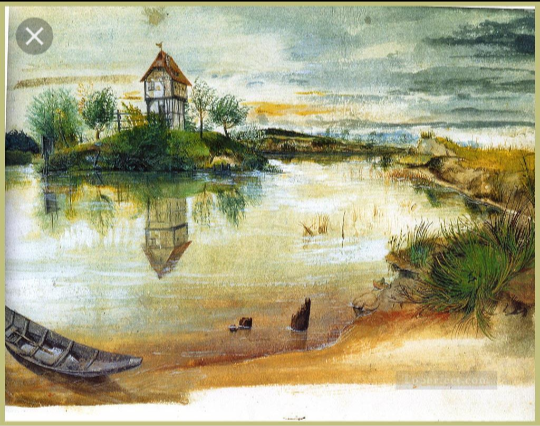
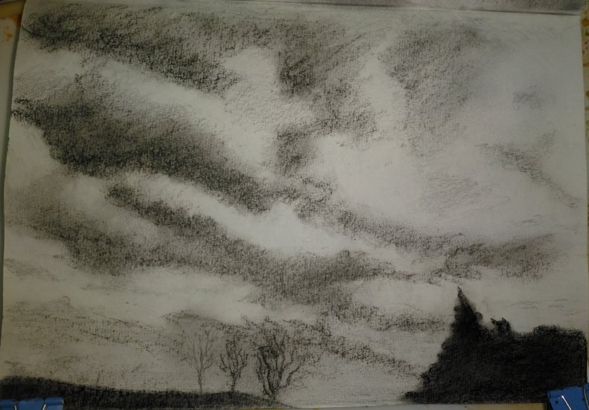
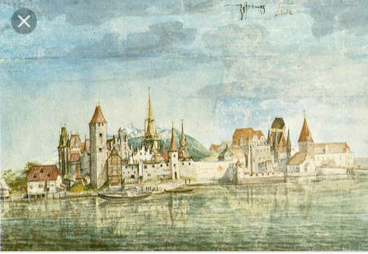
House by a Pond. ‘Dürer painted this watercolour soon after his return from Venice, probably in 1496. The site has been identified as a pond which was connected by a small canal to the River Pegnitz, near St John’s Church on the outskirts of Nuremburg. The composition is based around the circular form of the pond, a shape echoed by the carefully-painted boat in the foreground. The dark threatening clouds of the evening sky contrast with the calm water and its reflections.
The watercolour is inscribed, `House by a Pond’. The tall house, set on an island, probably served as a look-out post and a summer retreat in peacetime. Two years later Dürer depicted the same house, in reverse, in the background of his engraving of The Madonna with the Monkey.’ Web Gallery of Art.
I like the painterly style, almost sketchiness of this. Durer hasn’t felt the need to really blend one colour flawlessly into the next. he’s happy to let them just sit next to or on top of each other. I love the atmosphere and it has an oriental appearance to me.
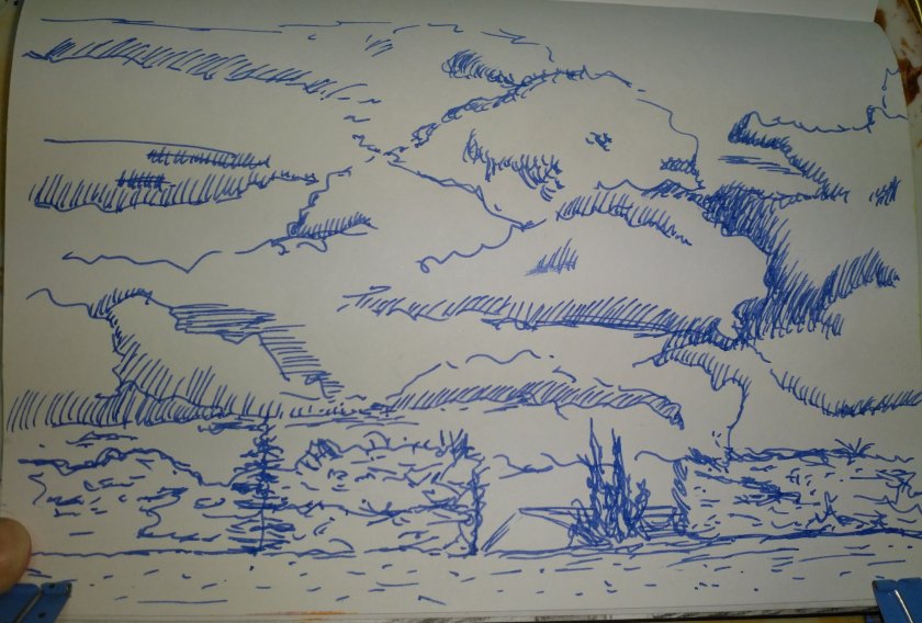
The Willow Mill. This watercolour and gouache painting appeals to me because it has lots of detail. I have painted water before and I know all to well how difficult it is to get right but I would love to be able to see this in real life and really get up close to see all of the brush strokes. I also like the sky. Druer has used different blues simply laid one on top of the other again, he has made a nice graduation towards the horizon to show aerial perspective. I could spend a long time admiring this painting but I won’t bore you with the details.
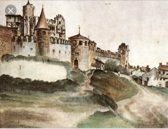
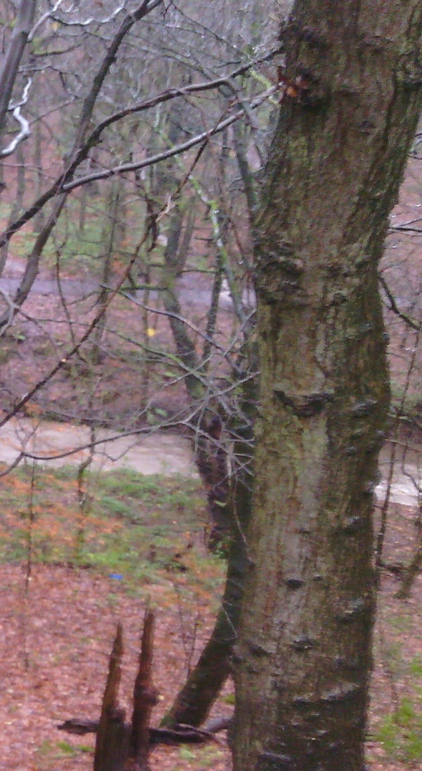
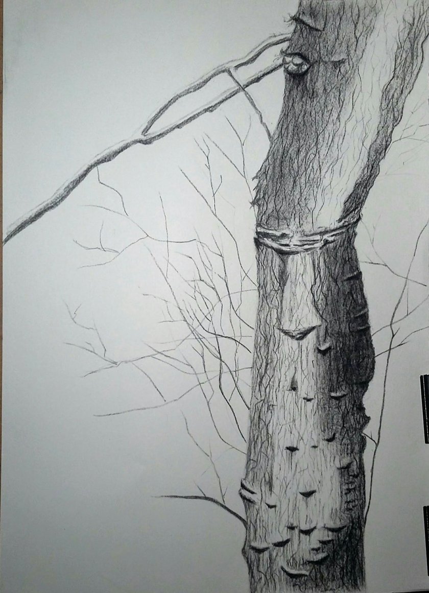
Castle at Trento. 1497. Pen and ink with watercolour, touched with white. The British Museum have classed this as a drawing whilst the rest have been paintings. I can only think this is because Durer has used a pen in places rather than a paintbrush throughout. I have chosen this because it has a good narrative to it. A lot could be read from this picture depending on your own outlook on life and that makes a great piece of art I think.
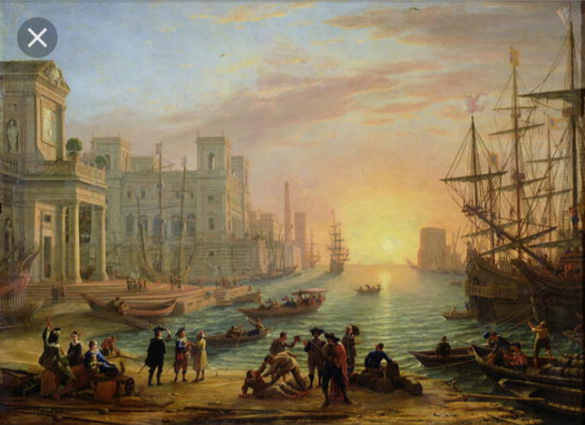
Claude Lorrain
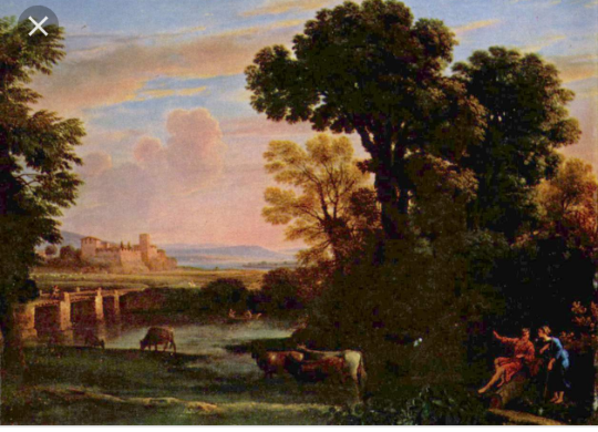
Pastoral Landscape 1648. Claude Lorrain.
Lorrain paints in a more picturesque style. He has beautiful well rendered scenes of trees, fields, animals and skies all done with exquisite blending and photorealistic techniques.
I was drawn to this image first of all by the pinks and blues of the sky. They place me at the end of a beautiful summers night when the sun is just going behind the horizon and the earth starts to cool. Then the castle in the distance drew me in closer, even though it is so far away you can still make out the battlements and windows in the walls. Then across the mountains, faded with a beautiful blue to express again aerial perspective to the huge dark and over bearing trees with every branch and shadow done painstakingly perfect. Finally the couple sat at the base of the trees having what seems to be a very good conversation about the view in front of them.
Le Mundo de Manue.
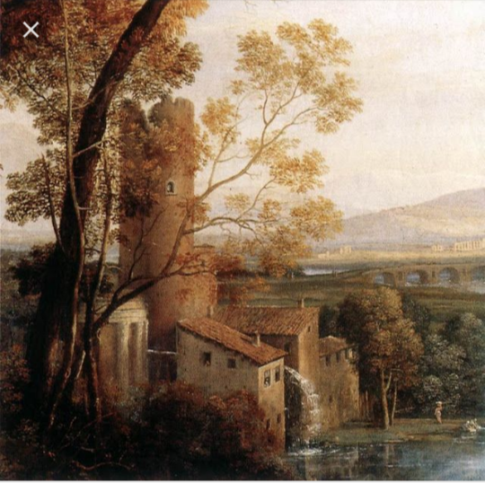
Sea Port at Sunset. both of the above pictures are much in the same style as his first one I chose. I especially like all the details he has put in and used such a good range of tone. I think it has put a lot of depth into the works and gives them an even more realistic style that even my camera can not capture.
Laurence Stephen Lowry
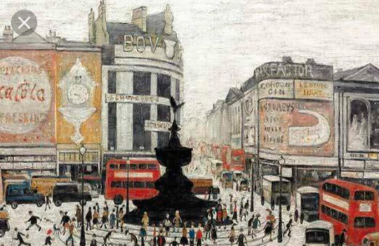
Piccadilly Circus in London. I have chosen this piece because it speaks to me. I have done studies of street scenes before. I have practiced perspective,although maybe not always successfully. So I am attracted to his techniques and want to learn about how he has used aerial perspective to give the impression of distance. Which brings me on to how he has used tone. The big bold monument? That stands in the centre of the piece is very dark and bold. You are immediately drawn to it as it jumps off the paper to you, then you start to explore the rest of the painting. I love his range of colours here. The bright Coca Cola sign and double decker red buses along the black shop signs keep your attention and lead you off into the distance of what was a busy London. I love looking at the people in the forefront, he’s taken a lot of time to give each one a personality, a purpose, there are children running, ladies shopping, an old couple on their way to market, men walking their dogs… I could look at this painting 100 times and still see something new every time.
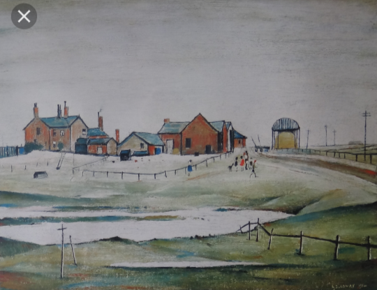
Landscape with farm buildings. I am attracted to the simplicity of this one. The simple wooden fence leads you to what looks to me like a pond. It is reflecting the same colour of the sky and only the little hills of the ground interrupt it. this leads you up the hill to the focal point of the painting. The farm and all of it’s buildings. There even seem to be the farmer’s family there to, done in his usual stick man style. I am impressed by the shadows in this piece. The darks in the grass really give it dimension and add a lot of interest for me.
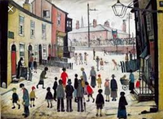
A Procession. 1938. This is very much like Piccadilly Circus in London. He has use aerial perspective although the building at the end of the street is still quite visable the viewer is in no doubt that it is in the distance. The people here though are much closer and we have a better understanding of what their about. I think that because this is a local street scene Lowry wanted to be a bit more intimate with the residents so that we have a better understanding of what life is like for them.
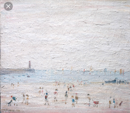
Lowry by the Sea. Spittal Sands, Berwick 1960. I think Lowry was on holiday when he painted this. Not only does the caption say that it is a Berwick scence but the whole atmosphere of it is lighter, fresher and more fun. His brush strokes are more bold and done in very light pastel shades. Families are enjoying the sunshine at the beach, sail boats are crusing in the distance and the pier leads us out to the light house at the end. Even tough there isn’t a huge range in this painting I am still very drawn to it because of how it makes me feel.
George Shaw
Shaw is renowned for painting the urban landscapes of his childhood council estate of Coventry. His pallet is quite adark and eerie one, and his brush strokes are very precise and detailed. Maybe this technique comes from the fact that he uses Humbrol enamel paints that are normally only used for painting airfix models.
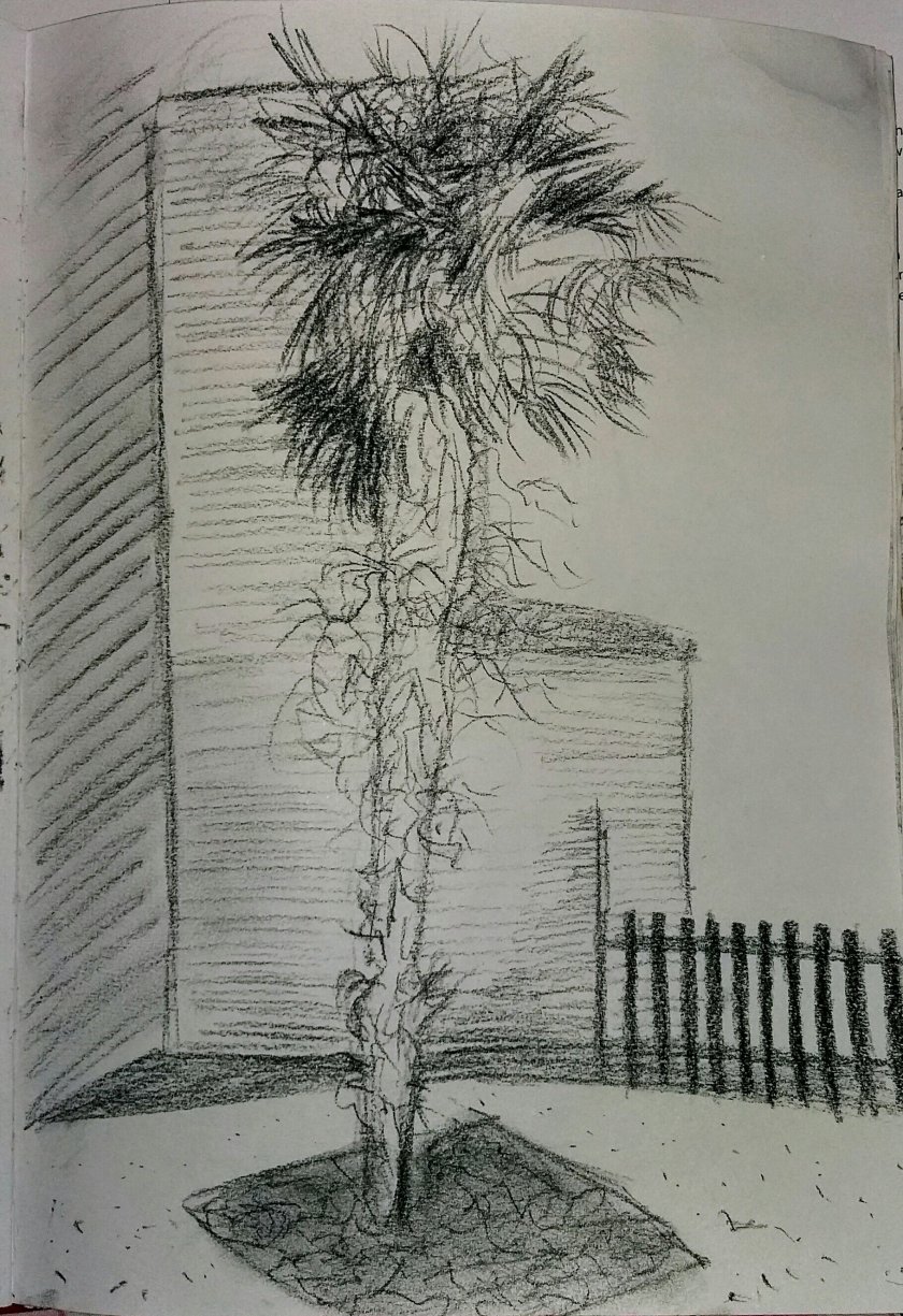
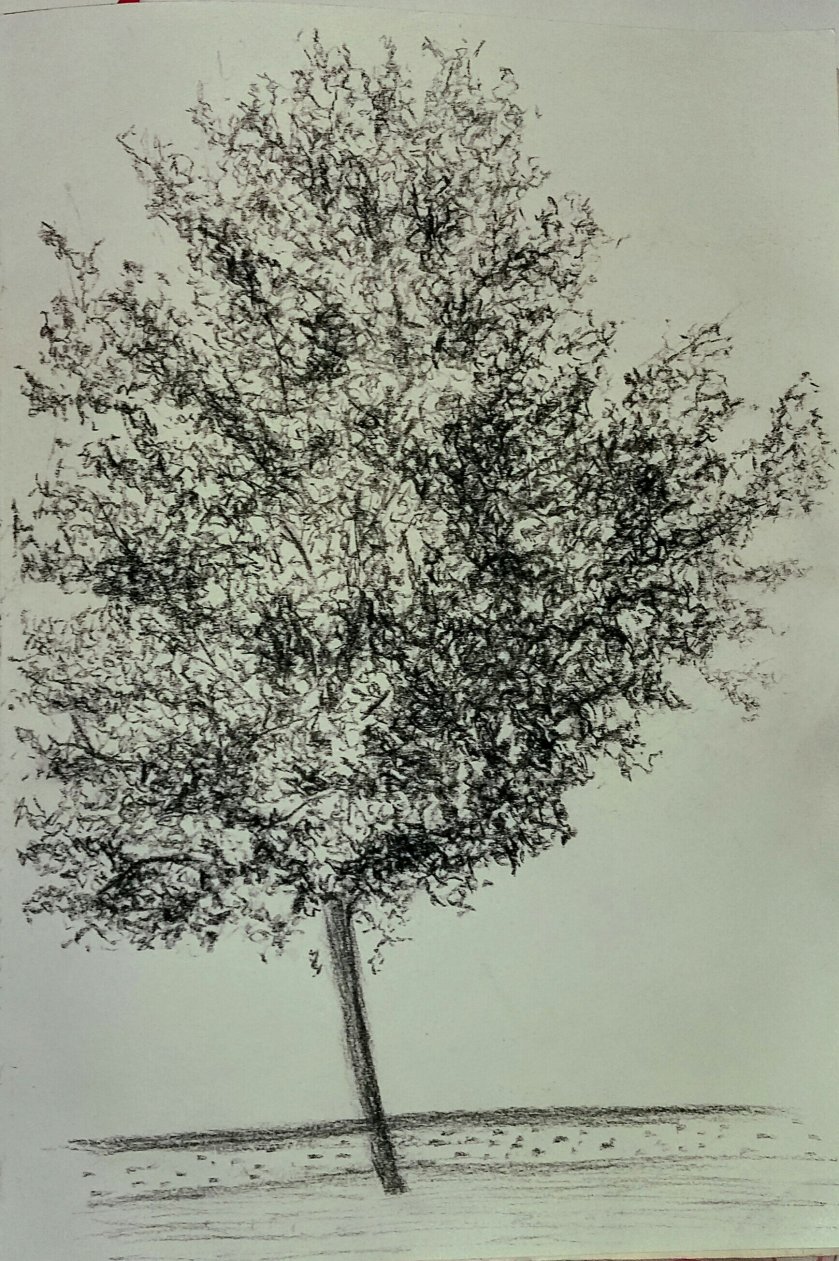
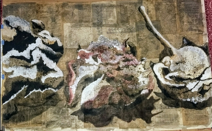
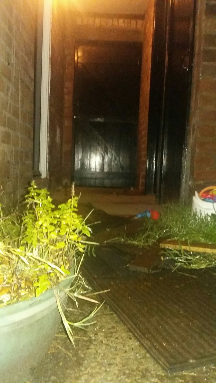
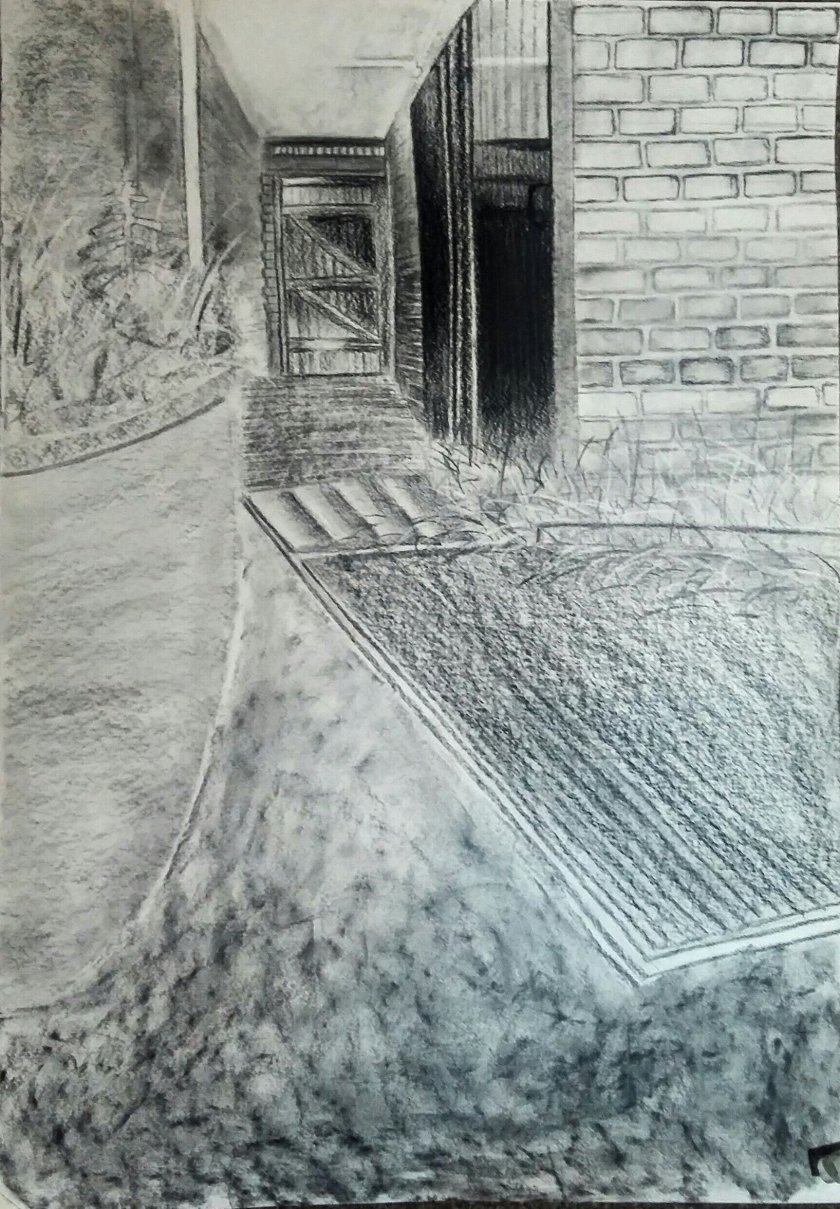
I have grouped the above 3 images together because they are very similar. I have got sketchbooks full of studies just like these. Where I have been studying a certain corner in the park or the alleyway that goes behind the pub and I have spent hours trying to get just the perfect angle of the fence, practising until I got it to a point that I could sleep that night. I never considered them to be a real piece of art though. I never imagined that someone would see the beauty of them as they are, they were just practices for me to learn how to draw.
I do like the broad range of tone Shaw has used. it gives the work a lot of character and interest. I will concentrate on tone more in my personal work and try some of his techniques when putting attention to detail.
Sarah Woodfine.
Woodfine trained as a sculpter. I think this gives her a greater understanding of space and how to use it when it comes to drawing. She uses a much more imaginative style than what we have been looking at so far. She leaves a lot of wide open space and very minimal tone. Seeing her work like this reminds me of the cardboard theatres that children make to make stories with. Leaves a lot to the imagination I think.